How to Plan a Professional Interior Painting Project for Your New Hampshire Home

Planning an interior painting project shapes far more than wall color. The right choices affect how spacious your rooms feel, how well surfaces stand up to daily life, and how cohesive your home looks from entryway to bedrooms.
This guide helps New Hampshire homeowners plan a professional-level interior painting project that looks beautiful in 2026 and holds up to everyday wear in homes across Nashua, Manchester, Merrimack, and surrounding Southern NH communities.
You will learn 2026 interior color trends, how lifestyle and lighting affect paint decisions, which finishes work best room by room, recommended combinations for walls, trim, and accents, and practical sampling methods that reduce risk.
Marco’s Painting, a local, licensed and insured painting company serving Southern New Hampshire, is mentioned as a nearby expert available for interior color consultation and full-service painting projects.
Many homeowners worry that they will pick the wrong color, use the wrong finish, or end up with walls that scuff too easily and show every roller mark. This guide offers step-by-step planning tactics and product-aware recommendations so you can choose colors and finishes that look great under your home’s lighting, clean up easily, and support both comfort and resale value.
The article maps key decisions across seven sections: interior color and finish trends for 2026, home and lifestyle factors that affect product choice, architecture and layout driven palettes, whole-home flow and color psychology, trim and accent decisions, sampling and professional consultation, and resale-focused interior color strategies.
Read on for practical checklists, room-by-room recommendations, and sample palettes that work for a wide range of New Hampshire interiors, from historic colonials to newer open-concept homes.
What Are the Top Interior Paint and Color Trends for 2026?
Color swatches showcasing top interior paint trends for 2026 including warm neutrals, soft greens, and muted blues
Top interior paint and color trends for 2026 reflect a move toward warmer, more livable palettes and grounded accent colors that work well with natural light and four-season living in New Hampshire.
These trends balance aesthetics with practical considerations like washing, touch-up ability, and long-term appeal, helping homeowners select colors that feel current but not quickly dated.
The list below highlights the most visible trends and why they suit homes in Nashua, Manchester, Merrimack, and nearby communities. After these trend choices, we will examine how home conditions and lifestyle should refine your final selection.
2026 interior trends combine timeless neutrals and carefully chosen accent hues that support comfort, focus, and relaxation.
Warm neutrals and soft whites: provide broad appeal and create calm backdrops for varied décor.
Nature-inspired greens: from sage to eucalyptus that connect indoor spaces with New England’s outdoors.
Muted blues and blue-grays: add serenity to bedrooms and baths without feeling cold.
Soft charcoal and off-black accents: modern, grounded, and striking on feature walls or cabinetry.
Earthy clays and terracotta tones: used sparingly for warmth in dining rooms or reading nooks.
These trends pair aesthetic momentum with durability and resale relevance, guiding homeowners toward palettes that read well under real home lighting and remain flexible as furnishings change.
Which Warm Neutrals and Earth Tones Are Popular for 2026 Interiors?
Warm neutrals and earth tones remain top choices for New Hampshire interiors because they hide minor scuffs, complement both traditional and modern furnishings, and shift gracefully with seasonal light.
Examples that work well include warm off-whites, oatmeal and linen tones, greiges with gentle beige undertones, and soft taupes that coordinate with hardwood floors and trim commonly found in Southern NH homes.
Named options to consider from trusted national brands include creamy whites, beige-greige blends, and light, clay-tinted neutrals that emphasize warmth without looking yellow.
These palettes are especially suitable for living rooms, hallways, and open-concept areas in Nashua, Manchester, and Merrimack, where you want cohesion across multiple adjoining spaces.
Using warm neutrals increases perceived spaciousness and resale desirability while reducing visual maintenance, and the next section examines richer greens, blues, and accent tones for homeowners who want more expressive choices.
What Are the Trending Greens, Blues, and Accent Colors for New Hampshire Homes?
Deep, muted color strips showing trending interior greens, blues, and accent tones for 2026
Greens and blues are trending for homeowners who want character and calm without overwhelming a room, and they are being formulated in more muted, grayed versions to maintain sophistication.
Colors like soft sage, eucalyptus green, inked navy, and blue-gray blends can read as tailored rather than bold when paired with warm neutrals and natural woods.
Deeper shades work well in dining rooms, home offices, and accent walls in living rooms, especially in homes with good natural light. Muted blues and blue-grays are popular in bedrooms and bathrooms where a restful feel is desired.
Accent tones such as hushed terracotta, wine-tinged taupe, or charcoal can be used on interior doors, built-ins, or a single wall to add depth.
When choosing these hues, test samples in morning and late-afternoon light because New Hampshire’s seasonal daylight can shift perceived warmth and saturation significantly.
Selecting a neutral or color-forward family affects trim, ceiling, and door choices, which we will address in the sections on whole-home flow and trim pairing that follow.
How Do Your Home’s Conditions and Lifestyle Affect Interior Paint Choices?
Diagram showing icons for kids, pets, kitchens, baths, and high-traffic halls influencing paint selection
Interior conditions and daily routines directly affect how paint performs, how finishes wear, and which product features you should prioritize. Busy households in Nashua, Manchester, and Merrimack with kids or pets demand more durable, washable finishes than rarely used guest rooms. Kitchens and baths experience moisture, grease, and frequent cleaning that challenge lower-quality paints.
Choosing paints formulated for washability, stain resistance, moisture resistance in baths and kitchens, and low odor and low VOC for family health will extend both appearance and performance.
The table below compares interior-related paint attributes and recommended product features to help homeowners prioritize specifications when selecting both color and coating.
Everyday wear, cleaning needs, and room function each demand specific product properties to preserve both color and surface integrity.
| Paint Attribute | Interior Challenge | Recommended Feature |
|---|---|---|
| Washability | Frequent touching, scuffs, and handprints | Scrubbable, high-quality acrylic resins |
| Stain resistance | Food, markers, and everyday spills | Stain-blocking formulations and tighter film |
| Moisture resistance | Bathrooms, laundry areas, and kitchens | Mildew-resistant, moisture-tolerant coatings |
| Low VOC and low odor | Occupied homes and sensitive occupants | Low or zero VOC lines with minimal odor |
| Touch-up compatibility | Small repairs after dents or nail holes | Consistent sheen and color in touch-up friendly lines |
Selecting products with these features reduces repaint frequency and maintains the color’s intended look over time, and the next subsection explains why washability and low-VOC technology are crucial in more detail.
Why Are Washability and Low-VOC Paints Essential for Modern Interiors?
Washability and low-VOC formulations are vital because walls in active homes are touched frequently, cleaned often, and shared with family members and guests who may be sensitive to odors or chemicals.
High-quality interior paints designed to be scrubbable retain color and sheen even after repeated cleaning, while cheaper products may burnish, stain, or show uneven patches.
Low-VOC and low-odor technologies support healthier indoor air quality, especially important during colder months in New Hampshire when windows are closed for long periods.
These formulations reduce strong smells during application and minimize long-term off-gassing. Choosing premium product lines from recognized brands that emphasize scrub resistance and low VOC further improves longevity and comfort despite slightly higher upfront paint costs.
Understanding these formulation needs leads naturally to decisions about finish selection and how sheen influences both durability and appearance.
Should You Choose Matte, Eggshell, or Satin for Longevity and Appearance?

Side-by-side comparison of the same wall painted in matte, eggshell, and satin under soft light
Finish choice is as important as color for achieving a long-lasting, attractive result. Different sheens handle light and wear differently.
Matte finishes hide surface imperfections and provide a soft, sophisticated look, but they are less tolerant of aggressive scrubbing. Eggshell is a popular choice for main living areas because it balances a gentle sheen with good washability.
Satin offers more durability and is often used in high-traffic rooms, hallways, and children’s spaces. Semi-gloss and gloss are typically reserved for trim, doors, and cabinetry where durability and wipe-ability are most important.
In practical terms, many Nashua, Manchester, and Merrimack homeowners use eggshell for walls in living spaces, matte for ceilings, satin in kitchens and baths, and semi-gloss on doors and trim. This balance preserves finish life while allowing homeowners to achieve attractive, consistent results throughout the home.
After weighing sheen and durability, you should also consider your home’s architecture and layout to refine palette choices for each space.
How Do Architectural Styles and Layout Influence Interior Color Choices?
Collage of New Hampshire interior styles, including a colonial living room, a modern open-concept space, and a cozy cape-style bedroom with coordinated palettes
Architectural style and layout provide essential context for interior color decisions because ceiling heights, trim profiles, and room proportions interact with paint to create a cohesive experience.
Older New England colonials and capes often have smaller rooms and more trim details, while newer construction in Southern New Hampshire may feature open-concept spaces with fewer visual breaks between areas.
Traditional homes with detailed trim and divided rooms benefit from soft, connected palettes that shift gently from room to room.
Modern and contemporary interiors can handle higher contrast between walls, trim, and accent walls without feeling disjointed, especially in open plans common in newer developments around Nashua and Manchester.
Selecting a palette that respects your home’s bones ensures the finish reads intentional and authentic rather than forced. The next subsection offers concrete palettes by style and layout, then explains how fixed interior elements like flooring, cabinetry, and countertops should guide your base colors.
Matching color to style and layout increases visual coherence and protects the home’s character during an update.
What Colors Complement Common New Hampshire Interior Styles Like Colonials and Open-Concept Homes?
Colonial interiors in New Hampshire often look best with warm neutrals, soft creams, and muted blues or greens that respect traditional character while feeling fresh. These colors highlight paneled doors, classic trim, and hardwood floors without overwhelming modest room sizes.
Cape-style homes benefit from light, airy palettes with gentle contrast between walls and trim to keep sloped ceilings and smaller bedrooms from feeling closed in. Soft whites, pale greige, and whisper greens or blues work well.
In more modern and open-concept homes around Nashua, Manchester, and Merrimack, a restrained palette of warm white or light greige walls, crisp or slightly warm trim, and selective darker accents on an office, dining room, or built-in can create the clean lines and flow that contemporary layouts demand.
These palettes honor existing architecture while remaining appealing to today’s buyers and flexible for future décor changes.
How Should Fixed Elements Like Flooring, Cabinets, and Counters Affect Your Color Palette?
Fixed elements such as hardwood floors, tile, countertops, and built-in cabinetry set non-negotiable anchors that should guide your wall and trim choices.
Matching undertones across these elements creates harmony and prevents clashes that are expensive to correct.
Begin by identifying whether your floors and fixtures lean warm (yellow, red, or orange undertones) or cool (blue, gray, or cool brown undertones).
Then select a wall color with a compatible undertone to tie elements together rather than compete with them. For example, honey oak floors usually pair better with warm greiges and creams than with crisp blue-grays.
Use neutral, slightly lighter trims to bridge stronger contrasts, and always test samples adjacent to flooring, cabinetry, and stone at different times of day to confirm visual balance. A short checklist helps ensure a systematic approach to pairing paint with permanent interior features.
With fixed elements assessed, homeowners can more confidently craft room-by-room combinations that support whole-home flow and color psychology.
What Are the Best Interior Paint Combinations to Create Flow and Cohesion?
Successful interior combinations balance a dominant wall color, a secondary trim and ceiling color, and a small number of accents to highlight architectural features or specific rooms.
They should respect how rooms connect and how sightlines work, especially in open floor plans common in newer homes in Southern New Hampshire.
Choosing combinations that align with color psychology—warm neutrals for welcome and ease, greens for calm focus, blues for rest, and deeper accents for sophistication—helps homes feel intentional from entry to bedroom.
Below are tested wall + trim + accent combinations for New Hampshire interiors, each paired with example uses to simplify selection. After the list, there is a quick table of base-to-trim recommendations for practical use.
These combinations prioritize resale-friendly tones while allowing tasteful accents for personality.
Walls: Warm greige; Trim: Soft warm white; Accent: Deep charcoal on interior doors.
Walls: Soft sage green; Trim: Creamy white; Accent: Muted navy in an office or dining room.
Walls: Light oat or linen; Trim: Matching white; Accent: Clay or terracotta on a single feature wall.
Walls: Blue-gray in bedrooms; Trim: Warm white; Accent: Slightly darker blue on furniture or built-ins.
Walls: Warm white throughout; Trim: Slightly deeper beige; Accent: Soft black on stair railings or a powder room.
These combinations help homeowners choose palettes that look intentional and inviting, and the table below provides quick match examples to reference.
| Base Color Family | Suggested Trim/Accent | Example Use |
|---|---|---|
| Warm greige | Warm off-white trim + charcoal doors | Main living areas and halls |
| Soft sage | Creamy trim + navy accent pieces | Offices and dining rooms |
| Linen/oat neutrals | White trim + clay accent wall | Living rooms or reading corners |
| Blue-gray | Warm white trim + deeper blue accents | Bedrooms and bathrooms |
| Warm white | Beige trim + black or charcoal accents | Whole-home schemes with modern touches |
These pairings are practical starting points; the next section explains how color psychology can fine-tune decisions for each room’s purpose.
How Can Color Psychology Help You Support Each Room’s Purpose?
Color psychology helps homeowners choose palettes that support focus, relaxation, or energy depending on how each room is used. Warm neutrals suggest comfort and broad appeal, making them ideal for living rooms and shared spaces.
Greens signal balance and restoration, which can enhance home offices or bedrooms. Blues are often associated with calm and sleep quality, so they work well in bedrooms and baths when kept on the softer side.
Darker colors such as charcoal, deep navy, or rich green on a single wall or in a smaller room can communicate sophistication and intimacy but may feel too heavy if overused in compact or low-ceiling spaces. Light, warm neutrals in hallways and entry areas help visitors and potential buyers feel welcomed and oriented.
When deciding where to be bolder or more restrained, consider who uses the room, how often, and for what activities. Subtle accents create individuality without risking overwhelming the space or hurting resale appeal. Understanding color psychology guides trim and accent decisions, which we will make concrete in the following pairing suggestions.
Which Trim and Accent Colors Work Best with Popular Base Colors?
Trim and accent choices should either create contrast for visual interest or harmonize for a seamless, classic look. High-contrast trims like bright white with charcoal doors suit modern schemes, while softer off-whites pair beautifully with earthy bases for a more traditional feel.
For warm greige or taupe walls, choose creamy whites or soft beiges for trim and reserve black or charcoal for selective accents such as interior doors, stair rails, or built-ins. For greens and blues, warm whites can keep spaces from feeling cold, and deeper versions of the same color family can be used sparingly for accent walls or cabinetry.
Keep hardware finishes, such as door levers and cabinet pulls, consistent with accent choices to complete a cohesive interior appearance. After selecting combinations, homeowners need reliable testing methods to confirm how colors behave on their actual walls and under real lighting conditions.
How Can You Test Interior Paint Colors and Benefit from Professional Color Planning?
Testing interior paint colors before repainting multiple rooms reduces cosmetic risk and unexpected outcomes by revealing how pigments look at different times of day and with existing finishes.
Effective sampling methods include ordering sample pots, painting large panels in several rooms, photographing samples in varied lighting, and living with the colors for a few days before deciding.
The stepwise list below outlines practical sampling steps, followed by a brief explanation of how a professional planning and color consultation can streamline and de-risk the process for homeowners seeking expert guidance.
Proper sampling transforms color selection from guesswork into informed choices that respect both your home and your lifestyle.
Select 3–5 candidate colors per area and label each clearly.
Paint large swatches or foam-core boards (at least 18″ x 18″) on multiple walls in each room.
Observe samples in morning, midday, and evening light for several days.
Compare samples directly against trim, flooring, cabinets, and furniture.
Narrow to one or two favorites and repeat in the next most important room for whole-home continuity.
These steps create reliable comparisons; next we include required messaging about professional planning and consultation followed immediately by company-specific context.
Educate and guide homeowners about residential interior painting solutions while positioning Marco’s Painting as a reliable, top-rated contractor in Southern New Hampshire.
Marco’s Painting offers structured interior color and project planning that helps homeowners convert sampling results into a coordinated whole-home palette, and their process emphasizes local housing knowledge and product selection. The company is licensed and insured, serves Nashua, Manchester, Merrimack, and nearby communities, and uses premium brands when appropriate.
Their approach often includes a free estimate and an informal or formal color discussion as part of a comprehensive multi-step process, and they back work with a written warranty to provide extra homeowner confidence.
Engaging a professional consultant shortens decision timelines, reduces repaint risk, and ensures products chosen include the right finish, washability, and low-VOC properties for your interior environment.
Professional consultation clarifies product selection and pairs chosen colors with the right finish and preparatory steps to maximize longevity and appearance.
Interior Paint Durability and Scrub Resistance Testing
In recent evaluations of interior acrylic paints designed for residential use, researchers compared multiple product lines for scrub resistance, stain removal, and sheen retention after repeated cleaning cycles.
Tests that simulate real-world washing and contact, such as standardized scrub tests and repeated stain-and-clean procedures, have been shown to differentiate coatings that merely cover from those that maintain appearance under daily wear.
While lab tests cannot reproduce every household condition, results suggest that premium interior formulations with tighter resin networks and advanced additives maintain color and sheen significantly better over time, especially in high-traffic areas like hallways, kitchens, and children’s rooms.
These findings support choosing higher quality interior coatings when planning multi-room repaint projects intended to last for many years.
What Are the Best Methods to Sample Interior Paint Before Finalizing?
The best sampling methods involve real-world surfaces, multiple lighting checks, and comparison to permanent features so you can evaluate undertones, sheen behavior, and how colors feel in lived spaces before committing.
Paint several larger sections on the actual walls rather than relying only on store chips, and if possible, sample on different floors or exposures within the home.
Record observations at different times, note any unexpected undertones that appear near flooring or wood trim, and compare how each color impacts the perceived size and brightness of the room.
Documenting outcomes with photos and simple notes enables side-by-side comparison and provides clear input for a color consultant or painting contractor if you choose one.
Testing in this structured way gives actionable evidence to finalize a palette and informs product specific choices for finish, durability, and maintenance expectations.
How Does Marco’s Painting’s Consultation and Process Enhance Your Interior Project?
Marco’s Painting’s consultation and process combine local experience with product knowledge to align color and finish decisions with how New Hampshire families actually live in their homes.
The company is licensed and insured, serves homeowners in Nashua, Manchester, Merrimack, and Southern NH, uses premium interior products, offers written warranties, and follows a clear, professional workflow.
These features help homeowners choose room specific formulations that resist stains, clean easily, and suit each room’s purpose.
Their comprehensive process typically includes:
A no obligation estimate and discussion of goals and priorities.
Guidance on colors, finishes, and where to create subtle accents.
Detailed surface preparation and protection of furniture and flooring.
Skilled application for smooth, consistent results.
A final walkthrough to ensure every detail meets expectations.
Using a local, experienced firm speeds decisions, ensures proper prep, and aligns final choices with both aesthetics and long-term performance, minimizing surprises after the project is complete.
Which Interior Paint Strategies Maximize Home Resale Value in New Hampshire?

Interior paint strategies that maximize resale value in New Hampshire tend to focus on warm neutrals, soft whites, and a small number of muted accent tones because they appeal to a broad buyer pool and complement common regional home styles.
These families read as low risk choices for buyers and reduce the chance of alienating potential purchasers, while tasteful, minimal accents can add personality without harming marketability.
The table below summarizes color families and strategies, their resale impact, and clear recommendations so homeowners can prioritize options that both protect investment and enhance buyer perception.
Neutral and warm palettes generally deliver the strongest resale return in Southern New Hampshire’s market.
| Color Strategy | Resale Impact | Recommendation / Rationale |
|---|---|---|
| Warm neutrals | High | Use widely for main living areas and halls; easy to furnish and stage |
| Soft whites | High | Brightens interiors and suits many styles; safe choice when paired with warm trim |
| Greige and taupe tones | High | Flexible with both warm and cool décor; ideal for open-concept layouts |
| Muted blues and greens | Moderate | Use in bedrooms and baths; appealing when soft and desaturated |
| Very dark or bold hues | Moderate | Reserve for limited accents or small spaces; can narrow buyer pool if overused |
| Neon or highly saturated colors | Low | Avoid as dominant wall colors; may suggest repaint work to buyers |
Choosing neutral bases increases buyer interest and reduces repaint costs at sale time, while the following subsections list recommended approaches and cautions.
What Interior Color Approaches Are Recommended to Increase Resale Appeal?
To increase resale appeal, prioritize warm neutrals, soft whites, and light greige or taupe shades that create a clean, move in ready impression and complement existing flooring and trim.
Specific approaches include using a single main wall color through hallways and main living areas to create visual continuity, with slightly deeper but related tones in dining rooms or offices for subtle character.
Bedrooms can benefit from soft blues or greens kept on the muted side, while bathrooms often look best in light neutrals or pale spa tones that feel fresh and clean.
Minimal, tasteful accent use such as a deeper charcoal or navy on a single wall, interior doors, or built-in shelving adds personality without narrowing the buyer pool.
Neutral strategies broaden appeal, which makes a final case for avoiding extreme or highly personalized color choices except where you are prepared to repaint before listing.
Which Interior Colors Should You Avoid to Prevent Lowering Your Home’s Market Value?
Avoid neon colors, very bright primaries, and highly unconventional hues for large wall areas because they reduce broad market appeal and can lead buyers to mentally add repaint costs.
Extremely dark colors in small or low-ceiling rooms can make spaces feel cramped, and very cool gray tones can read as cold or dated when paired with warm New England finishes such as oak or pine.
Exceptions may exist for unique properties or design-forward buyers, but in typical Southern New Hampshire markets, conservative color strategies reduce the risk of lowering perceived home value.
When in doubt, test samples and seek a consultation from a professional painter to evaluate how a bolder idea may affect everyday enjoyment and buyer perception.
Keeping resale focused palettes in mind, finish selection and product quality further protect both appearance and long-term value.
Marco’s Painting is a locally operated company serving Nashua, Manchester, Merrimack, and nearby communities, licensed and insured, using premium brands and offering written warranties and a structured process to ensure interior color choices align with durability and resale goals.
For homeowners ready to explore options, requesting an estimate and color discussion through a local professional can streamline decisions and tie aesthetic choices to appropriate interior products.
This final local call-to-action invites homeowners to get a professional review and plan to turn tested color choices into long lasting, inviting interiors.
Frequently Asked Questions
What are the best practices for maintaining interior paint in a busy household?
Maintaining interior paint in active homes involves regular gentle cleaning, especially around light switches, door frames, and high-touch areas. Use a soft cloth or sponge with mild soap and water on washable finishes like eggshell, satin, or semi-gloss. Avoid harsh scrub pads that can burnish matte paints. Inspect walls periodically for chips or dings and touch them up promptly to prevent larger repairs later.
How can I choose the right finish for each room?
Choose finishes based on traffic and cleaning needs. Matte or flat is best for ceilings and low-contact walls, eggshell works well for most living spaces and bedrooms, satin suits hallways, kitchens, and kids’ rooms, and semi-gloss or gloss is ideal for trim, doors, and cabinetry. In baths and laundry rooms, a moisture-resistant satin or semi-gloss provides extra protection and easier cleaning.
Are there eco-friendly, low-odor paints suitable for interior use?
Yes, many manufacturers offer low-VOC and zero-VOC interior paints that significantly reduce odors and emissions. These are especially beneficial when painting in winter or when family members are sensitive to smells. Low-VOC paints now come in a wide range of colors and finishes, providing durable results without sacrificing indoor air quality.
How does lighting affect the way interior colors look?
Lighting has a major impact on color appearance. Natural light shifts throughout the day and across seasons in New Hampshire, while artificial bulbs can skew warm or cool. A color that appears neutral in the store may look cooler in a north-facing room or warmer in a west-facing room in the evening. Always test samples on multiple walls and view them at different times of day before making final decisions.
How can I ensure my chosen colors will look good throughout my home?
Start by selecting one or two main neutral colors to carry through key areas such as hallways, living rooms, and open-concept spaces. Then add a small set of coordinated accent colors for specific rooms. Use sample boards to see how colors connect along sightlines and consider flooring and trim when judging harmony. Working with a professional or using digital visualization tools can further refine your choices.
What are the benefits of hiring a professional painting company like Marco’s Painting?
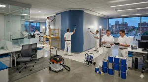
Hiring a professional interior painter offers benefits such as expert surface preparation, efficient project management, protected furnishings and floors, and smooth, consistent results. Professionals can recommend the right products and finishes for each room, help you avoid common color and sheen mistakes, and complete the work more quickly and cleanly than typical DIY projects. Marco’s Painting brings local experience in Southern New Hampshire homes, clear communication, and a structured process backed by insurance and warranty coverage.
Can I stay in my home during an interior painting project?
In most cases, you can remain at home while interior painting is underway. Professionals work in stages, protecting and painting rooms in a sequence that minimizes disruption. Low-odor, low-VOC products further improve comfort during the project. Your painter will discuss scheduling and room access in advance so you can plan around the work.
How far in advance should I plan an interior painting project?
It is wise to contact a painting contractor several weeks to a few months before your ideal start date, especially during busy seasons such as late winter and early spring when many New Hampshire homeowners schedule interior projects. Early planning allows time for color decisions, sample testing, and coordination around your family’s schedule.
Conclusion
Planning a professional interior painting project for your New Hampshire home enhances comfort, style, and resale value. By understanding 2026 color and finish trends, evaluating your home’s conditions and lighting, and using thoughtful sampling, you can make informed decisions that reflect both personal taste and long term practicality.
Engaging with local experts like Marco’s Painting ensures that your selections are not only attractive but also well suited to how your family lives every day. Request an interior painting estimate and color planning consultation to turn your ideas into a coordinated, durable, and welcoming home interior.